Hm, yeah I think it's a little too soft, and shadowy. Also I think the brown in the back as gone..too brown, haha, although I would say I like the color of the flower, as it's nice and rich. :D
Thanks for your feeback guys! Yes, there's another version somewhere on here. It's quite a bit different. I was going for the rich pastel look with this, but couldn't quite get it to look right. I converted it to black and white and I think it works better, but it's still missing something. Art is such a laboursome thing! *brushes brow dramatically*
I like it, it looks mystical. I personally might go a little softer on the flower, to emphasize the drop more, and take out the white border as it makes it look too confined (imho)..... I still like it, though :) ~~Rene

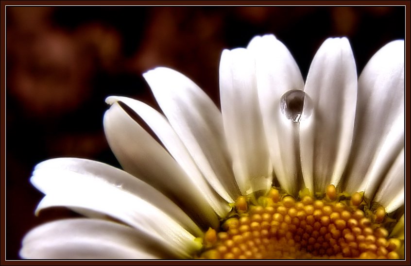
A bit too glowy? Wasn't there an original of this that you posted a while ago? I think I liked it better...
ReplyDeleteHm, yeah I think it's a little too soft, and shadowy. Also I think the brown in the back as gone..too brown, haha, although I would say I like the color of the flower, as it's nice and rich. :D
ReplyDeleteThanks for your feeback guys! Yes, there's another version somewhere on here. It's quite a bit different. I was going for the rich pastel look with this, but couldn't quite get it to look right. I converted it to black and white and I think it works better, but it's still missing something. Art is such a laboursome thing! *brushes brow dramatically*
ReplyDeleteIn my naivete, I love it. Very different in color than the B&W version that you called Solitaire (I think). This one should be "Sunrise".
ReplyDeleteI like it, it looks mystical. I personally might go a little softer on the flower, to emphasize the drop more, and take out the white border as it makes it look too confined (imho)..... I still like it, though :)
ReplyDelete~~Rene